Introduction.
As a software developer with accounting background, I rely on Excel's data visualization tools daily to illuminate insights. Trendlines and moving averages are particularly indispensable for identifying patterns in financial and scientific data sets. By smoothing out random fluctuations, these elements reveal the true underlying trends, preventing analytic tunnel vision.
In this tutorial, I'll guide you through adding these essential visuals to enhance your Excel data analytics at any skill level. Whether you're a beginner charting your first data or an advanced user building complex forecasts, this article has actionable steps for harnessing the power of moving averages. Follow along as we visually analyze sample data sets together. Whether you're a beginner, intermediate user, or an advanced Excel aficionado, I've got you covered with step-by-step exercises.
Understanding Trendlines and Moving Averages:
Trendlines and moving averages are indispensable tools in data analysis, allowing us to identify patterns and trends that might not be immediately apparent in raw data. A trendline is a straight or curved line that best represents the overall direction of the data. A moving average, on the other hand, smoothens out fluctuations by calculating the average of a specific number of data points, revealing hidden trends.
Basic Level: Adding a Simple Trendline:
Let's start by adding a basic linear trendline to a chart:
· Create a chart from your data. In this case I added a Link with the dataset, so just follow the instructions.
To make the things simpler and transparent I just selected columns B6:B106 and D6:D106 to make the bar 3D char
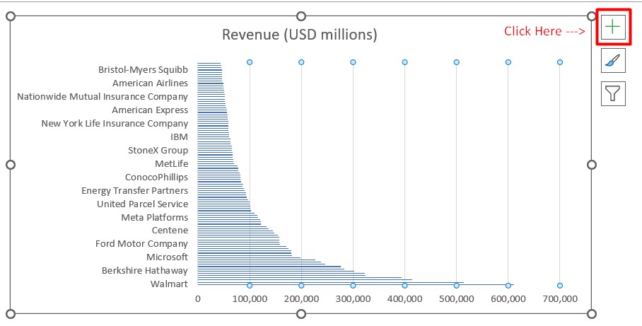
· Click on the chart go to the + sign on the top right.
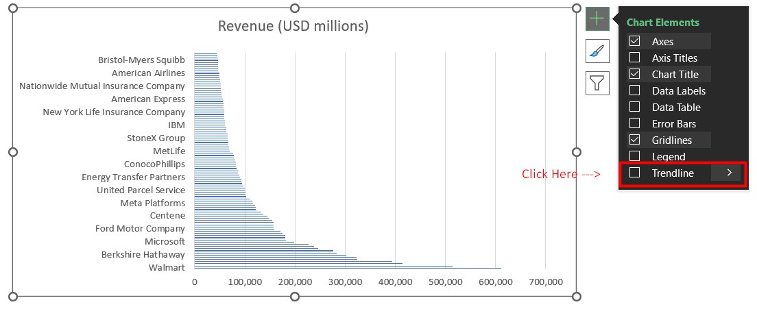
· You will see the drop off menu where you are going to select.
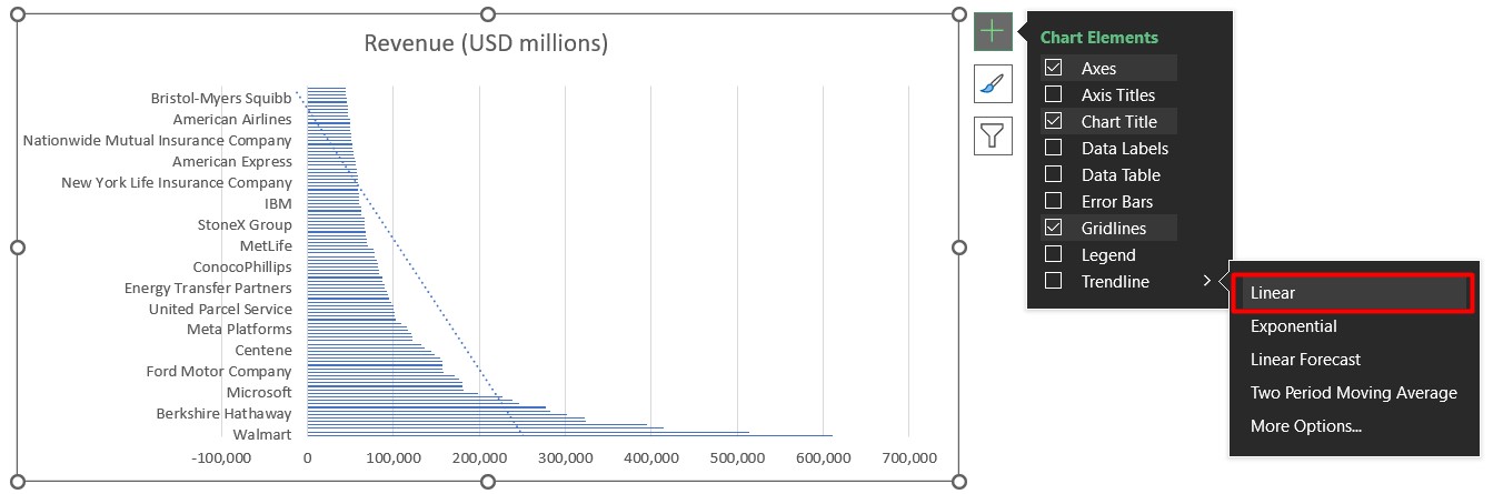
· Choose the "Linear".
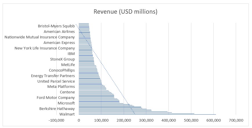
· Voila! You now have a simple trendline that illustrates the general trend of your data.
Intermediate Level: Fine-Tuning Trendlines and Adding Moving Averages:
Expand your skills by adding a trendline that fits your data better, like an exponential or polynomial trendline. In the example I added the Exponential One
To add a moving average, calculate the average of, say, a 3-month period:
· Create a new column with the moving average formula (In the example I provided to you I already added the column).
· Add the moving average data to your chart (Same as I already Added).
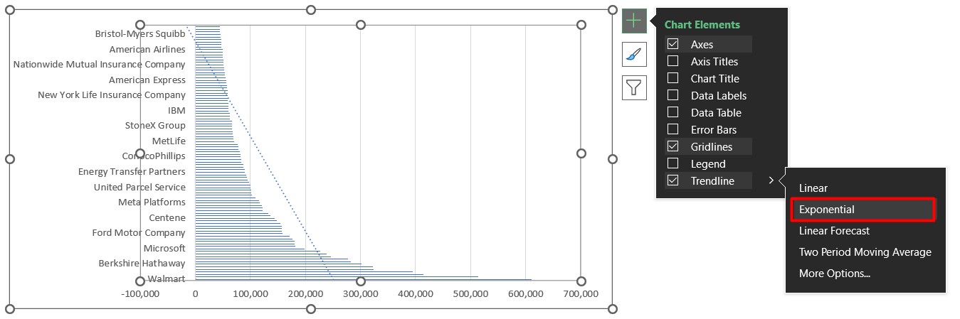
· Adjust the moving average period to see how it affects the trend.
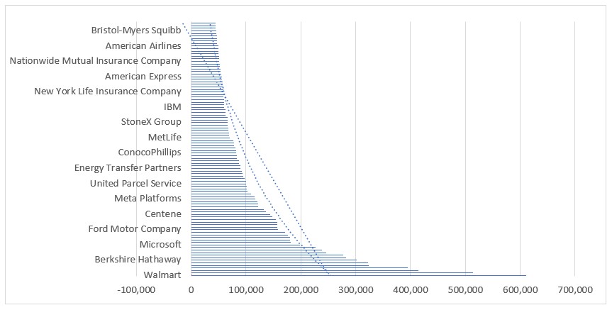
Advanced Level: Custom Trendlines and Advanced Using Forecast:
· I added another column to put the Forecast function which Predicts future values based on trends.
· A brief explanation of Forecast is that only allows numeric values that’s why in Cell D5 put 1, 4 for E5 and 7 for F5 so:
=FORECAST($F$5,D7:E7,$D$5:$E$5)
D7:E7 is for the first month and fourth month data\
$D$5:$E5 is a absolute reference for periods 1 and 4
· I added the new column to the chart.
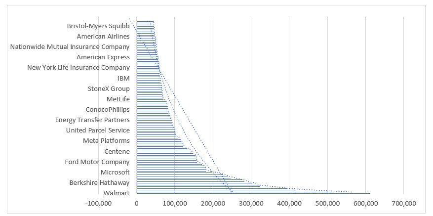
· Changed the Trendline and as you can see you can observe the behavior.
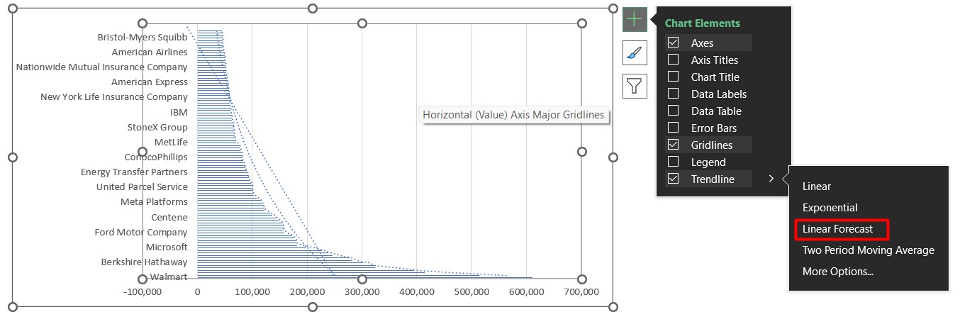
· Voila!!
Conclusion: Visualizing Insights, Empowering Decisions:
As a software developer armed with accounting knowledge, your ability to add trendlines and moving averages to Excel charts is a powerful asset. You're not just crunching numbers; you're unlocking insights that can guide strategic decisions, making you an invaluable asset to any team.
Stay Curious, Stay Connected:
I hope this article has illuminated the potential of trendlines and moving averages in Excel charts. If you have any questions or need further guidance, don't hesitate to reach out. Follow me on social media for more data analytics tips and insights. Remember, the fusion of programming and accounting can lead to remarkable insights – keep exploring!